Extrema Italy
3D
/
Design
/
Visual
(
2024
)
Scroll Down


Overview
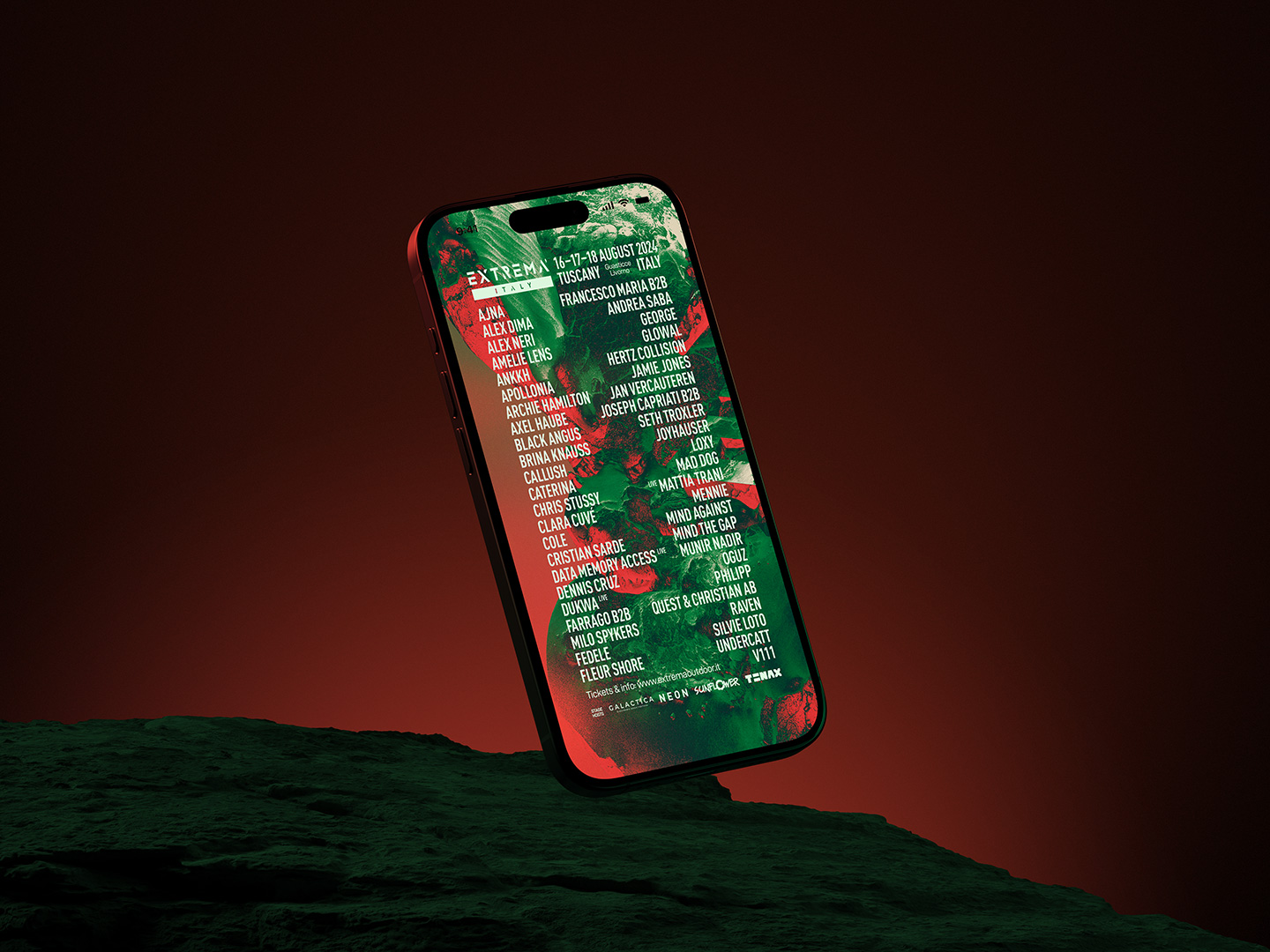
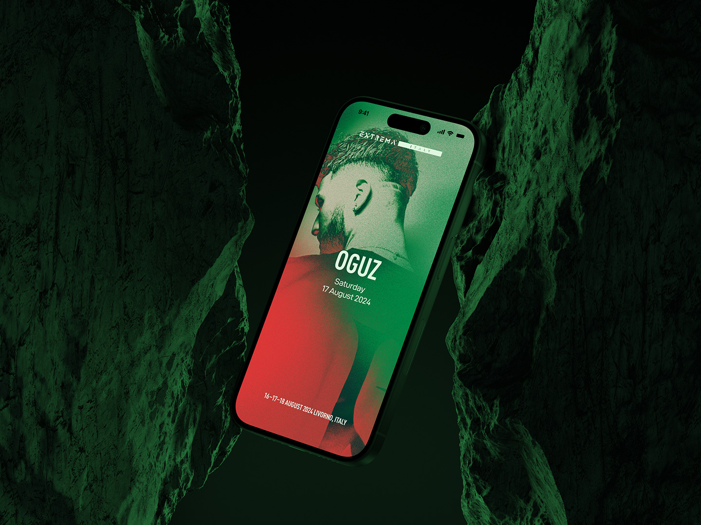
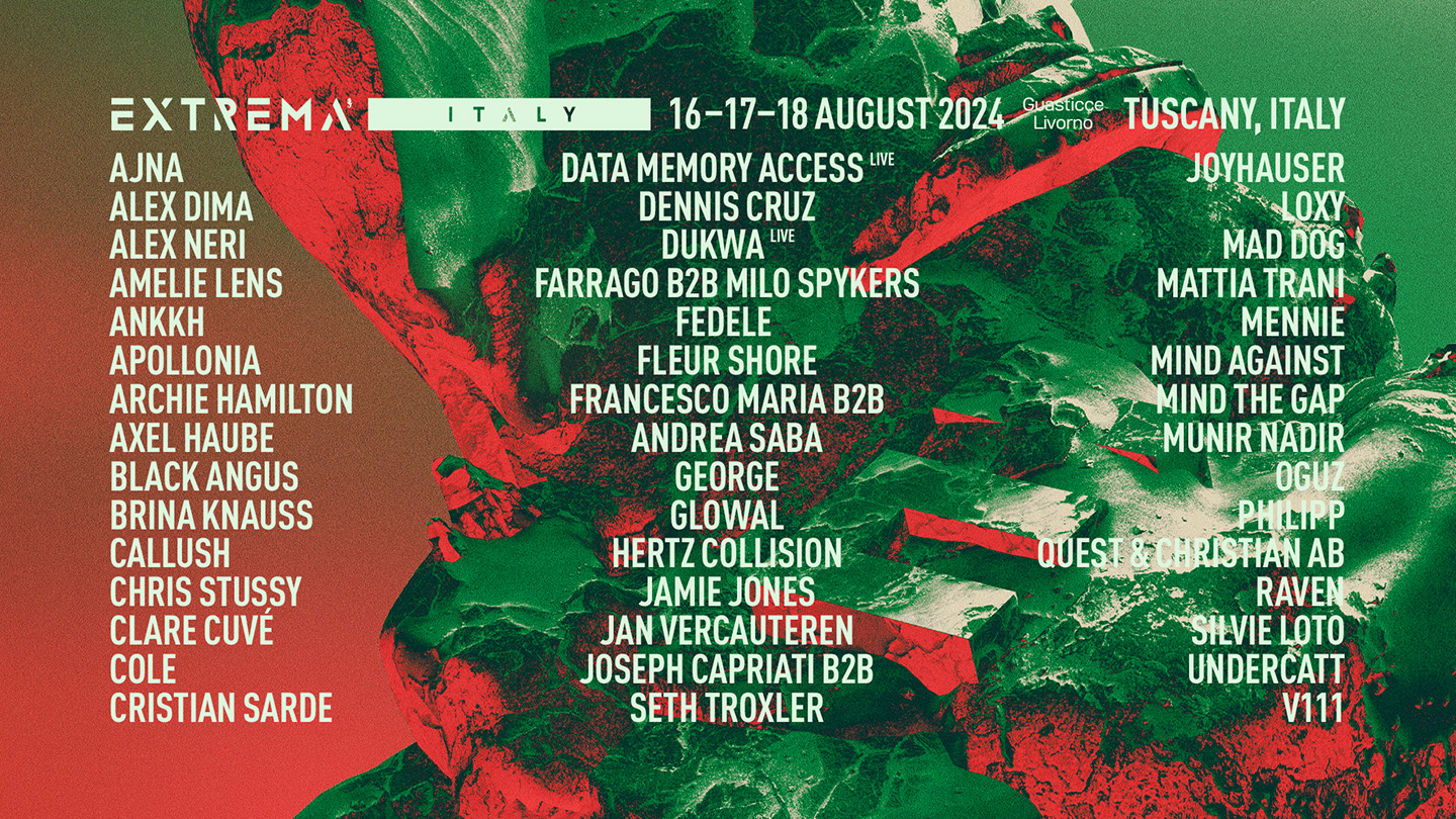
Following its long-standing presence in Belgium, Extrema Outdoor expanded to a new location in Italy - marking a new chapter for the festival. The visual identity for the Italian edition needed to build upon the branding and visual language established earlier that year for the home edition.
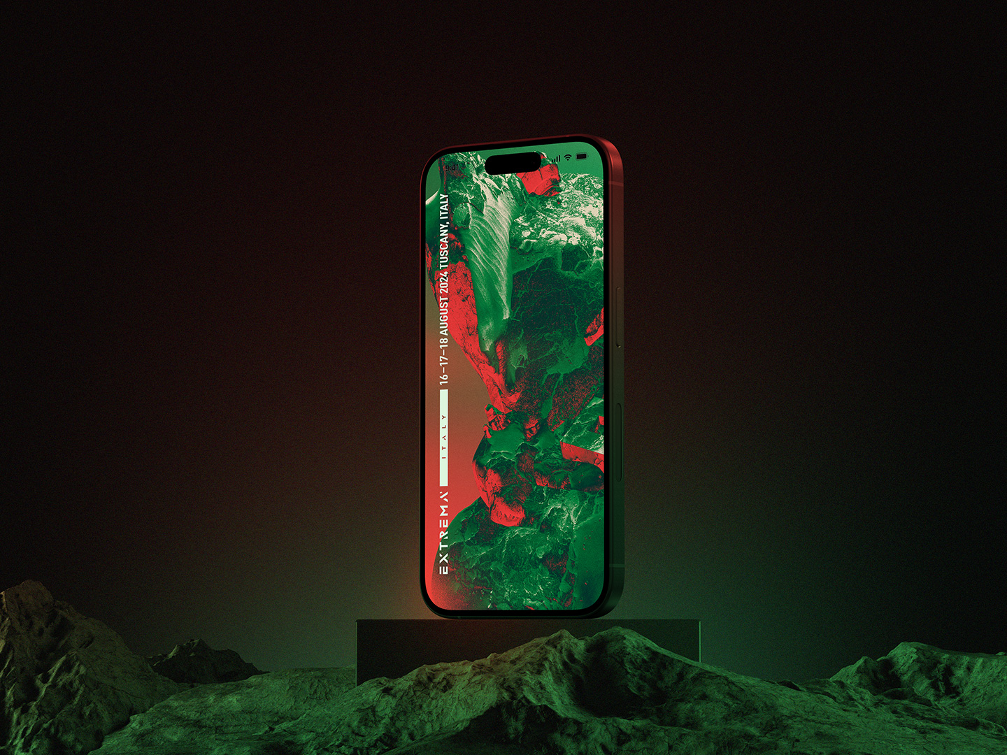
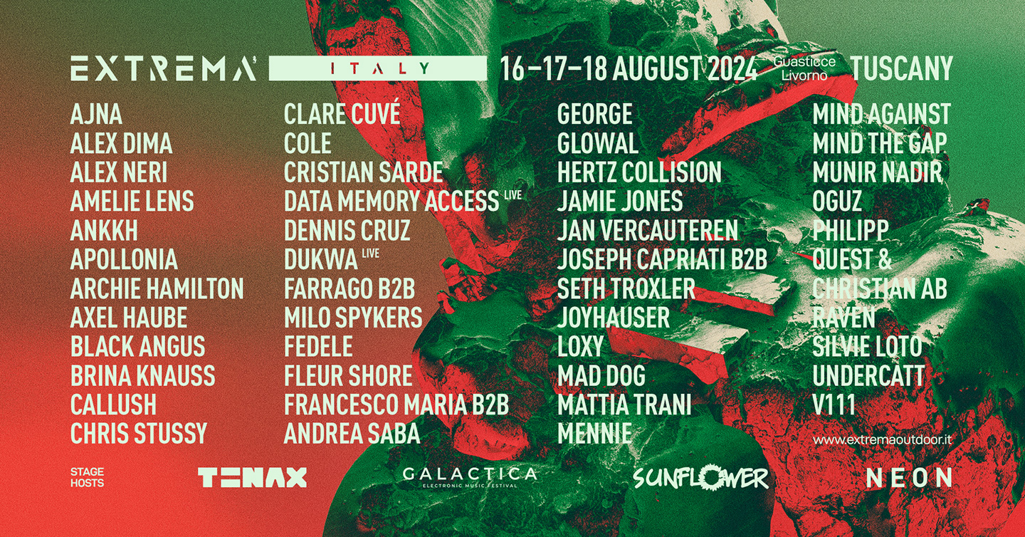
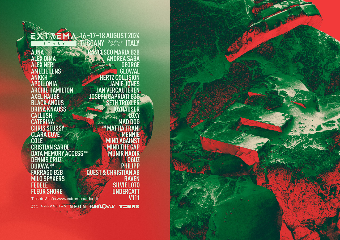
The foundation of the design was the same 3D-rendered artwork previously developed, adapted with a new color palette inspired by the Italian flag. Vibrant red and deep green served as the primary tones, complemented by a warm sand hue to evoke the white element of the tricolore.
This localized adaptation maintained consistency with the Extrema brand while offering a fresh, site-specific twist tailored to its new audience and setting.




No items found.
RELATED projects
(#)


